Hello everybody, just another quick blog post that I’m writing today, partially to get some thoughts off of my head that have been lingering in whatever remains of my brain at the time since last night, and partially to get rid of the numbness in my fingers that the colder weather outside has kindly gifted me.
I know this one’s a bit different from the other blog posts I’ve made. Well, really that’s something of an exaggeration, considering the only other blog posts I’ve done have consisted of around less than three hundred words. Plus, I’m fairly sure that I’ve only made about for our five of them, due to my chronic laziness.
Sorry, where was I?
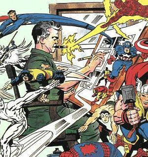
I just wanted to take the time to talk about how great Jack Kirby’s artwork was and still is to this day, only helped by his prolific portfolio meaning that there will ALWAYS be something new for me to look at.
Thinking back on it now, I think my earliest experience with Jack Kirby was at a party I went to when I was much, much younger (being born in 1998, this was probably sometime around the start of the new millennium, the early 2000s).
Although I wouldn’t really rediscover or properly study his original work for another nine to ten years afterwards, I think this initial viewing generally summed up why I would fall in love with his work whilst later taking my artwork more seriously as a teenager.
Me and a number of the other children were given a series of colouring pens, along with this odd black paper that had white designs and images on them, the intent being for us to fill in the white areas with the colours provided.
Some of the designs were fairly standard but fun cartoon designs, depicting popular kids show characters.
I believe Robbie Rotten, a cartoon parrot and Optimus Prime were among the mix.
Looking back on it now, that was PROBABLY a work of Kirby’s art that had been included among the designs of this collection of fairly cheap party entertainments.
However, there was also this weird picture of Hulk that was far stouter and stockier than the muscular, taller version modern audiences are now more familiar with (Amplified by the recent release of the 2003 Aang Lee, Hulk film). It actually made the character look far more monstrous by himself, even when he wasn’t angry or screaming.
The 'blockish' design at the time puzzle but ultimately amused me, so I chose that image to colour in for the next hour with green and purple pens. I’m fairly sure the Hulk was running out towards the viewer, arms and legs outstretched in opposite directions. The odd perspective, along with the weird (but definitely not crude) art style created a dramatic shot that should perhaps had the risk of looking grotesque if done by virtually any other (more restrained) artist. And yet Kirby’s dynamic art style nonetheless made the image itself still seem appealing.
I’m glad I rediscovered him and his importance to Marvel(‘s existence) properly later, after having moved to Los Almendros Spain with my parents in late 2015. I found his artwork once again whilst browsing the school computers at lunchtime at the San Pedro International College during my first year there, whilst looking at some of the masters of the illustration medium.
That’s about it really, just wanted to get this bit off of my mind.
Thank you for reading. 😊
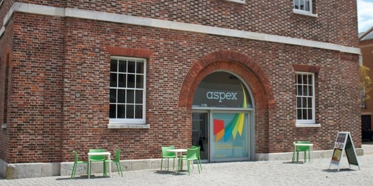
 Being a small area, within the middle of the Gunwharf Quays of Portsmouth, between the harbour and university district,it can be quite easy to accidentally miss or pass by the Aspex Gallery.

